
User Research
User Testing
Redesign
Prototyping
Data Tables
Heuristic Analysis
Clustr
Concept for an IRL social experiences mobile app

Date
September - November 2025
Role
UX Designer, Researcher
User Testing
6 Participants
Overview
Users can find their clustr!
Clustr is a location-based social app designed to help people discover and join local communities centered around shared interests and experiences. Users can explore nearby “clustrs,” which are dynamic groups formed around events, hobbies, or activities, and connect with like-minded individuals before attending gatherings in person. The platform bridges the gap between digital connection and real-world socializing, making it easier for users to meet new people in a comfortable and meaningful way.
Whether someone is looking to attend an event alone, find a new hobby group, or simply expand their social circle, Clustr offers a seamless way to explore what’s happening nearby. By combining geolocation, interest-based discovery, and group interaction, the app fosters genuine, community-driven engagement that transforms local experiences into lasting connections.
Process
How it Started
A friend of mine had ideated an idea for an app that builds local community. We talked further and it turned into a discussion of building groups around shared interest - but something that would translate into real life. I eventually envisaged events where attendees can see a QR code for our product and see who's in the group, reach out and form connection in a shared space.
"Hotspot" was the first name we brainstormed

Rudimentary sketch showing the map feature and the filters

sketch showin the social aslpect of the app

First Low Fi Clustr Screen
Defining the Market
User personas are a great way to define and target users, keeping in mind the unique appeal of this product that isn't served by other products such as Bumble BFF, meetup, etc.


Laying out the Groundwork
A sitemap provides a clear structural foundation, helping me understand content relationships and user flows before moving into visual design.

First Design Iteration
The wires seen here are used to make the clickable prototype used for testing. The decoy user is Charlie in Philadephia

User Testing
Let's See What the Users Think!
6 participants agreed to follow a user test flow where the user logs in, explores clustrs, messages a friend, and uses the map to check location. These tasks were timed. After the user test flow, they were asked a few broader questions. They were recorded and given a rundown on user testing and how they should communicate. Some used mobile devices while others used desktop.

Sorting for Insights
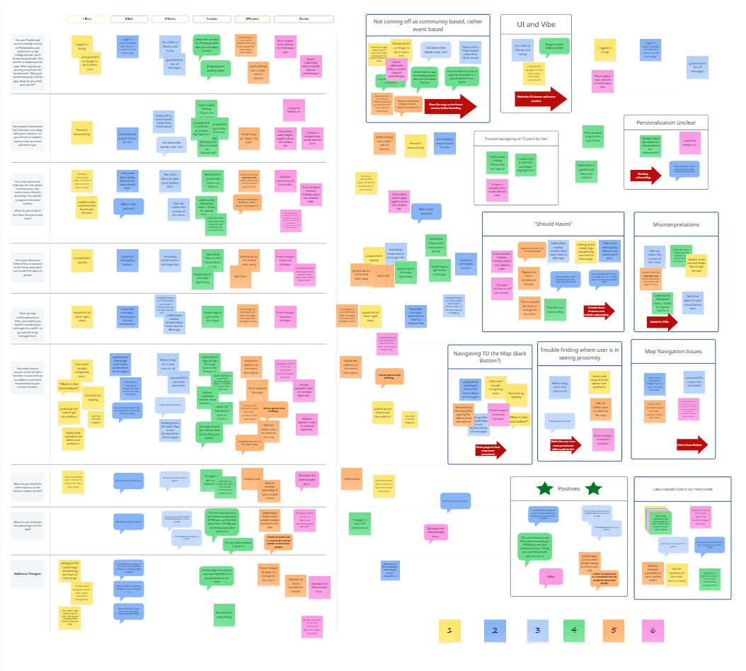
After user testing, insights were gathered via Miro.
Insights from User Testing
Clustr did not Seem a Community-Building App to Most Participants
Users interpreted the home screen as an event-based app
Users were not clear what a clustr is
Localization did not come across
None of the participants mentioned user-created clustrs
Solution: Switch to map view as the home screen default. This way, the user doesn't land on a list of clustrs upon logging in. They'll have a sense of where they are and what's around them. Giving them a list view option after that instinctually suggests that the list of clustrs pertains to them and their surroundings. The branding can also be uplifted to signal community. Adding a CTA to create a cluster on the home screen can indicate that the user can create a clustr and signal community.
Map Providing a Painpoint
4/6 users tried pinching and zooming. I could not apply that in the prototype, but ideally the built app would have that ability
Half the participants could not locate where they are on the map
Navigating back to the map from messages was tricky for 4/6 participants. Generally, participants would get confused or use other methods (back on the browser, swiping, etc) to get back to the clustr map.
Solution: Have a zoom button on the map despite final product being pinchable. This would increase intuition. As for user location, the "you are here" indicator can be made much more prominent. A line tracing from the user to the clustr can more clearly display proximity. Since users had a tough time navigating back to the map from "all messages", the logo can act as a home button.
Lack of Comprehension from Most Users
Users could not identify the following elements:
2 users did not pin Andre Suarez as the creator of the Fishtown Art Fair clustr.
2 users did not know what the join clustr button did, one of them thinking it was to join a group chat
Solution: Have a clear and visible labels to CTAs. New "Create Clustr" option on the home page lets the user already know that clustrs are created by users so they can infer who the profile on the clustr is.
"Should Haves"
All of the participants had suggestions of features they expected or a user path they would follow including:
Link to google maps suggested by 2 users
Profiles being linked to their Instagram so the user can get an idea of them
Half users wondered about their preferences (onboarding)
A user said they'd prefer if it showed how many people were in the clustr
A user cited the logo bringing back users to home
A user cited option to share location to friends
Solution: Include most of the listed features. Map should link to Google Maps, users can opt to link their instagrams to their profiles and the clusters should state the number of members. Also infobox on the "clustrs for you" page would reduce a lot of confusion present during the user tests.
UI Gives a Dated and Clunky Vibe
Users stated various impressions of the UI including that it's "blocky", gives "bakery vibes" among others.
Solution: Redesign UI to be clean, lighter and more modern. The bottom navbar should be redesigned to better standards with the protruding current tab eliminated to reduce bockiness.
Positive Impressions
"I think I'd wanna use it. It would be cool for people to meet new people"
Participant 5
"It's good if you want to attend something but have no one to go with. It's definitely much safer as a woman"
Participant 3
"I use Facebook currenlty for events and connecting but it would be good to have it all in one place"
Participant 2
"On one hand you can find events around you. OTOH you can find stuff you're into. Thirdly you can find people who are into it"
Participant 4
Design
Second Iteration Designed Based on User Input
This is but another product added onto an already designed and shipped dosing app. The top menu can expand to to change parameters and buttons and text format were carried over as well. The dosing however had to be modified and timeline design had to indicate repeated dosage over time, pauses etc.


Redesign Details
Home
List View
Clustr
Clustr Options
Clustrs For You
Account
Home Redesign
New landing page after logging in opens to the map to let the user know where they are and what’s around them immediately.
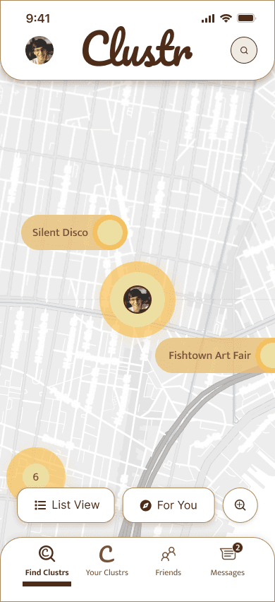
Header: Search is minimized since it would be a secondary method for users to find events and people. The account CTA has been moved to the header since it would be used to set preferences and information - so it would not be accessed much after onboarding. Clustr logo also takes user back to home.
User location is better highlighted to reduce confusion. Clustrs in the area are more prominently visible.
“For You” could have been made more prominent, but since it doesn’t pertain to the local community it was kep visually secondary.
Zoom option added to add accessibility even though ideally the map would be pinchable.
Bottom Navbar: Navbar has been redesigned to better spacing standards and given a more clean and modern UI. Messages has been moved to the bottom nav for better access.
Outcome
Results from Redesign
All of the participants agreed to go through the flow again and here are the outcomes!
33% average time reduction in completing flow
50% average error reduction
Users intuitively knew to use the new features (Google Maps and Instagram links)
Cleaner and modernized UI
Better comprehension of what a "clustr" is and community based nature
Conclusion
What would I do differently?
Test additional user flows beyond the primary one, including creating a clustr, to capture a more complete end to end experience.
Conduct more thorough testing of the filter system since it is essential for discovering and refining nearby groups.
Reduce familiarity bias by introducing new participants for testing second iteration of the design.
I used UX Pilot, and AI plugin for Figma for rapid prototyping based on a prompt. This gave me a great starting point for designing the second iteration. In the future I will definitely leverage AI to a greater degree.
Explore a dark mode option for the app
Extensively audit and annotate for accessibility